|
Figure Number |
Caption |
Subcaption |
Image
(click on image for larger view) |
|
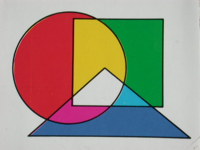
1 - 3 |
Additive color mixing |
|
|
|
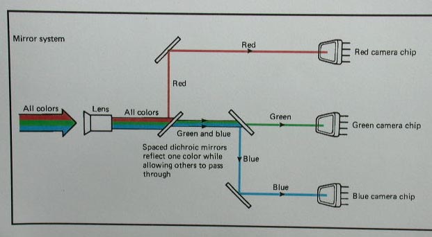
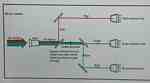
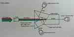
1 - 4 |
Three-chip color camera systems
to break colored light into its primary colors. |
|
 |
|
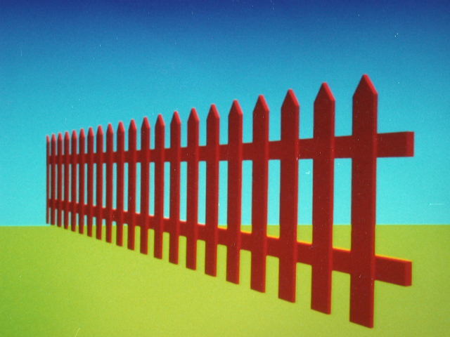
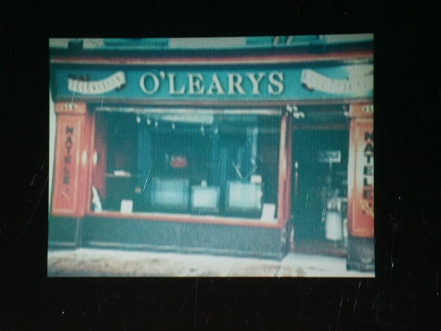
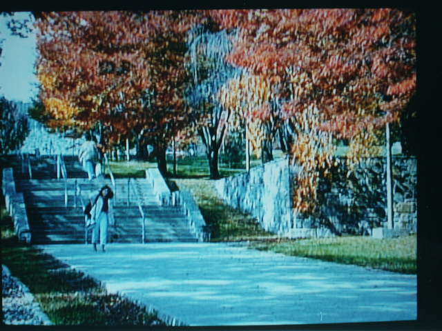
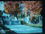
1 - 8
part 1 |
RGB vs NTSC images. |
This RGB picture from a computer
is sharp, and the colors are pure. |

|
|
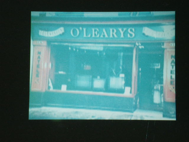
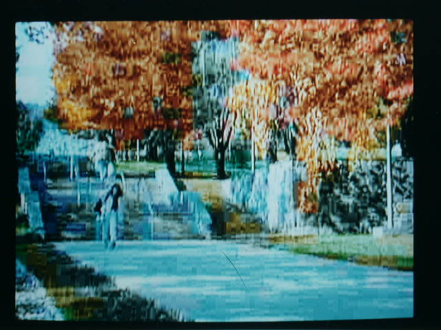
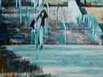
1 - 8
part 2 |
|
The same picture in NTSC looks smeared,
the colors have changed some, and artifacts such as dark edging
and MOIRE appear. |
|
|
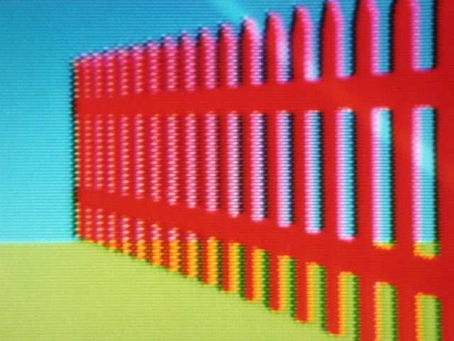
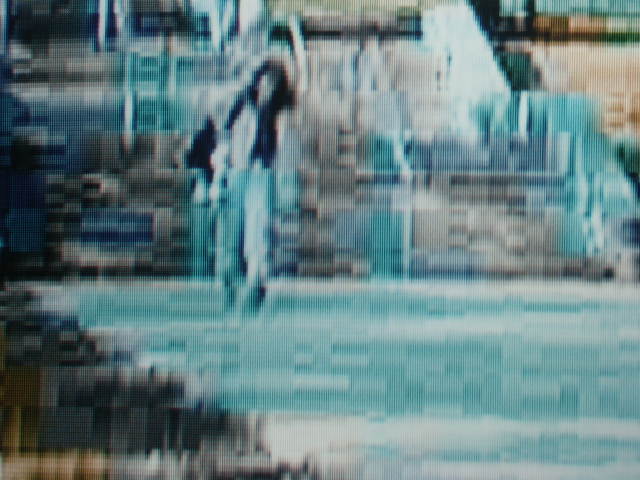
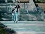
1 - 8
part 3 |
|
A closer look at NTSC reveals MOIRE,
crawling colored dots along the edges of colors. |

|
|
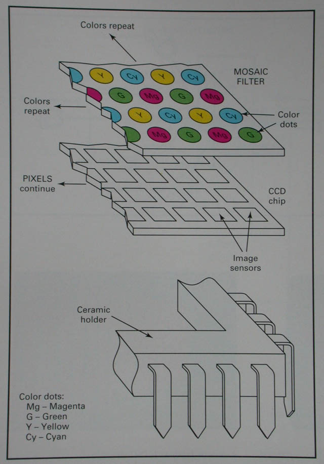
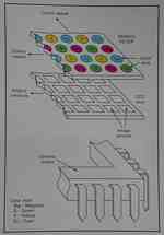
6 - 4 |
MOSAIC filter on a ONE-CHIP color
CCD camera |
|
|
|
6 - 7 part 1 |
|
A closer look shows the individual
pixels in the display. The picture is fuzzier than a black-and-white
viewfinder's, making it little help when you're trying to focus
the camera lens. |
|
|
6 - 7 part 2 |
|
Viewed at an angle, the color turns
pale and green. |
|
|
6 - 7 part 3 |
Problems using LCD VIEWFINDERS |
Color isn't very accurate or bright.
Color is best when the screen is viewed head-on. |
|
|
7 - 25 part 1 |
Camera filters (Courtesy of Cokin) |
Before using GRADUATED FILTER, sky
is pale and washed out. |

|
|
7 - 25 part 2 |
|
After using GRADUATED FILTER |

|
|
7 - 25 part 3 |
|
Before using CORAL FILTER |
|
|
7 - 25 part 4 |
|
Image "warmed" by CORAL
FILTER |

|
|
9 - 27 |
COLOR TEMPERATURE mismatches |
Outdoor light from our left looks
bluish compared to 3200 degree K quartz light from right. |

|
|
9 - 27 |
|
Common fluorescent light from our
left mixes poorly with incandescent light from our right. |

|
|
9 - 32 |
Colors on TV are slightly different
from real life. |
This well-adjusted color TV monitor
still fails to render colors exactly as they appear to your eye
in the studio. Colors tend to fade and become bluish. |

|
|
11 - 22 part 1 |
CHROMA KEY using blue |
Camera #1 |
|
|
11 - 22 part 2 |
|
Camera #2 |
|
|
11 - 22 part 3 |
|
CHROMA KEY |
|
|
11 - 22 part 4 |
|
Camera #1 |
|
|
11 - 22 part 5 |
|
Camera #2 |
|
|
11 - 22 part 6 |
|
CHROMA KEY |
|
|
11 - 22 part 7 |
|
Camera #1 |

|
|
11 - 22 part 8 |
|
Camera #2 |
|
|
11 - 22 part 9 |
|
CHROMA KEY |
|
|
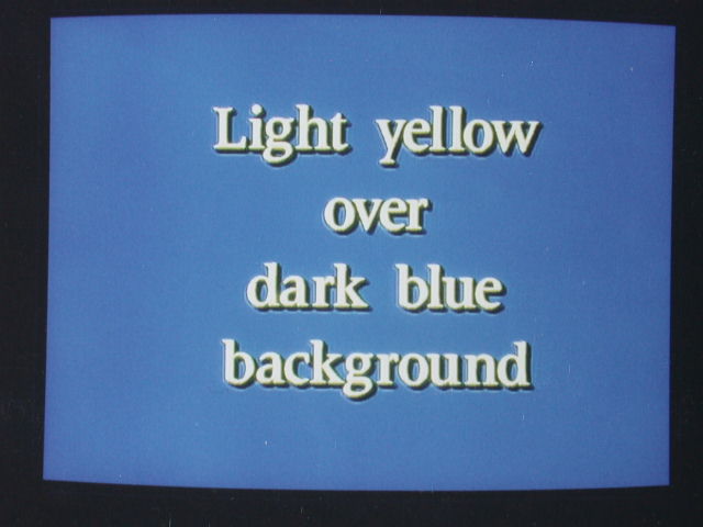
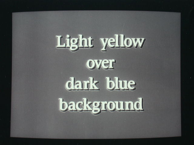
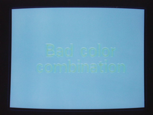
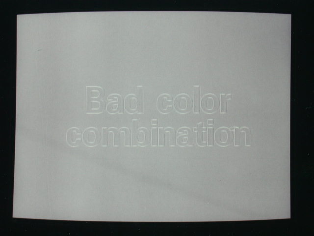
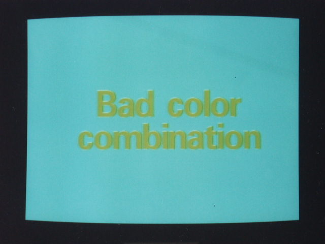
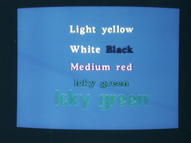
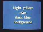
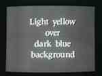
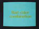
12 - 11 part 1 |
Good and bad colors for lettering
and backgrounds |
Light yellow over blue background
is visually appealing ... |
|
|
12 - 11 part 2 |
|
... and also shows up well on black-and-white
TV. |
|
|
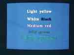
12 - 11 part 3 |
|
Green letters over a cyan (blue-green)
background look awful and are also hard to see. Avoid colors
that are near each other on the COLOR WHEEL or near each other
on the rainbow or on the color selector continuum of your CHARACTER
GENERATOR. |
|
|
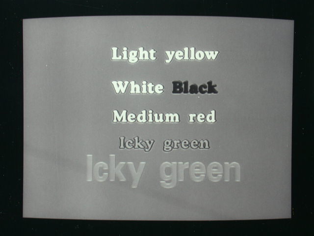
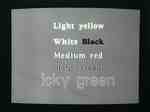
12 - 11 |
|
Also when letters are the same brightness
as their background, they disappear when viewed on black-and-white
TVs as seen here. |
|
|
12 - 11 part 5 |
|
Yellow over green or blue-green
looks bad. |
|
|
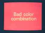
12 - 11 part 6 |
|
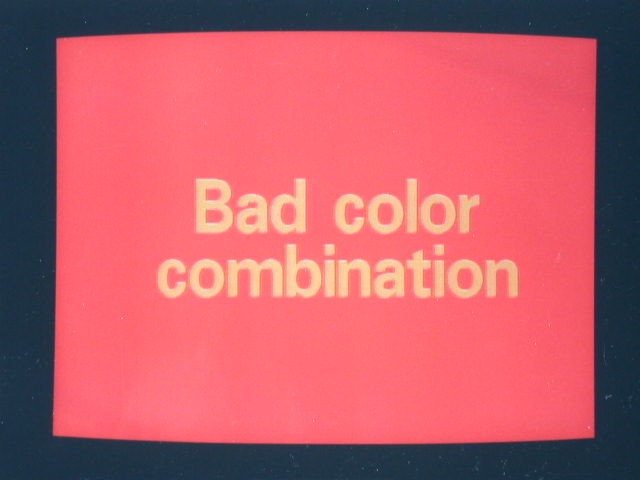
Yellow over red looks bad. |
|
|
12 - 11 part 7 |
|
Green letters over blue background
look bad ... |
|
|
12 - 11 part 8 |
|
... and are saved only by the edging
when displayed in black-and-white. |
|
|
12 - 11 part 9 |
|
Saturated yellow letters may look
okay in color but look bad in black-and-white. |

|
|
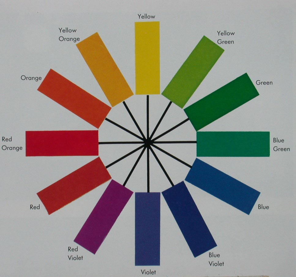
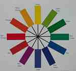
12 - 12 |
The COLOR WHEEL |
|
|
|
12 - 15 |
DUBNER CURSOR MONITOR in the SELECT
mode for choosing colors and FONTS. |
|
|
|
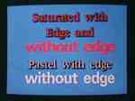
12 - 20 |
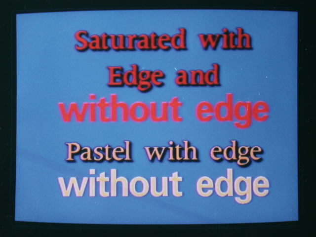
Saturated colors look fuzzy, making
lettering hard to read. Stick to pastels or white letters. |
|
|
|
12 - 36 part 1 |
Compression ratios compared |
Matrox Studio high compression (level
1) stores 37 minutes of audio and video per gigabyte. Picture
appears slightly blurry and blocky. |
|
|
12 - 36 part 2 |
|
Close-up of screen showing high
compression blockiness |
|
|
12 - 36 part 3 |
|
Matrox Studio low compression (level
5) stores 11 minutes audio and video per gigabyte. Picture looks
quite sharp and natural. |
|
|
12 - 36 part 4 |
|
Similar close-up of screen. Blockiness
is barely visible. |
|
|
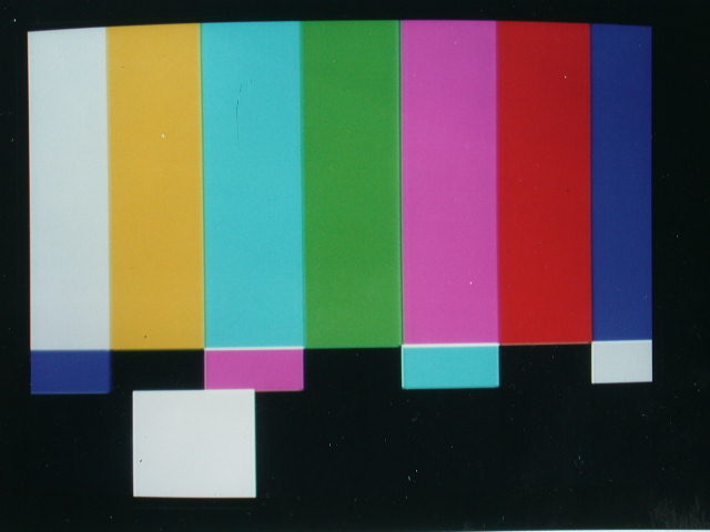
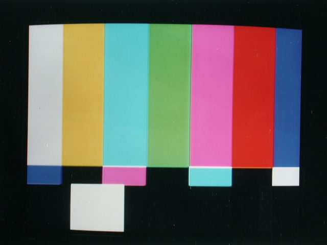
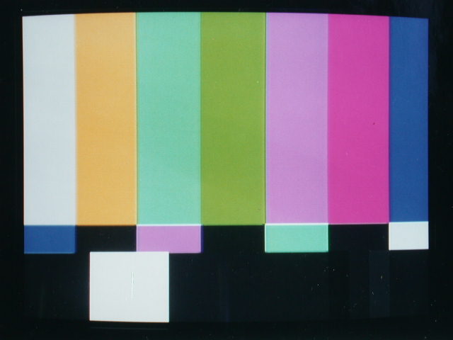
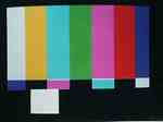
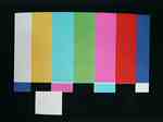
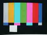
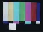
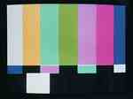
15 - 14 |
COLOR BARS as seen on a properly
adjusted monitor |
|
|
|
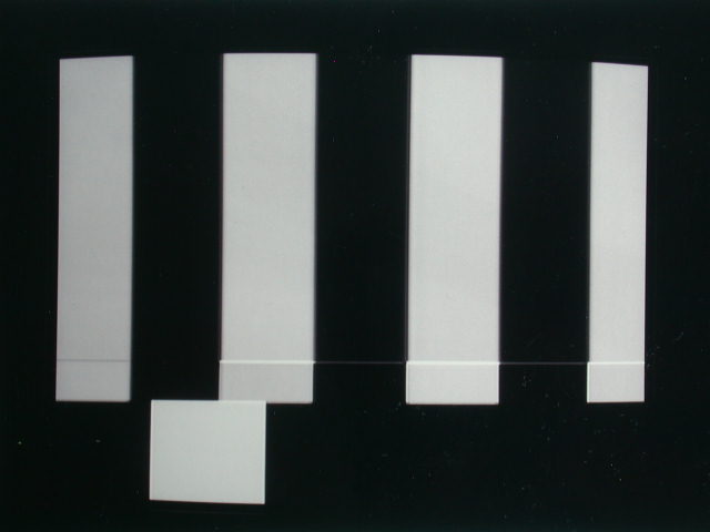
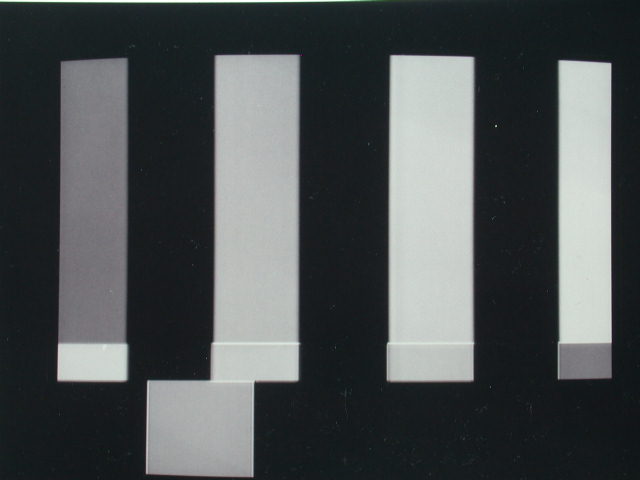
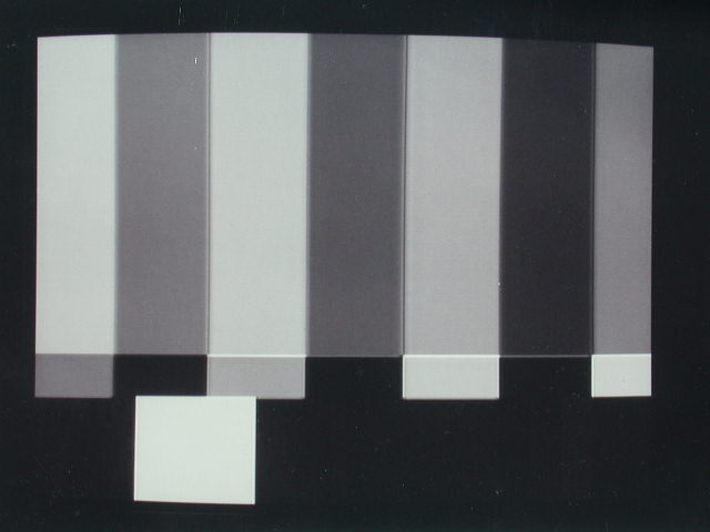
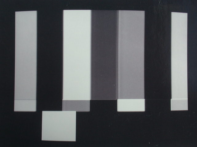
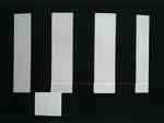
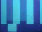
15 - 23 part 1 |
SPLIT FIELD COLOR BARS help you
adjust a color TV monitor having a BLUE GUN switch. |
COLOR BARS on a well-adjusted color
monitor. Note: PLUGE was not activated on the generator for this
series of photos. |
|
|
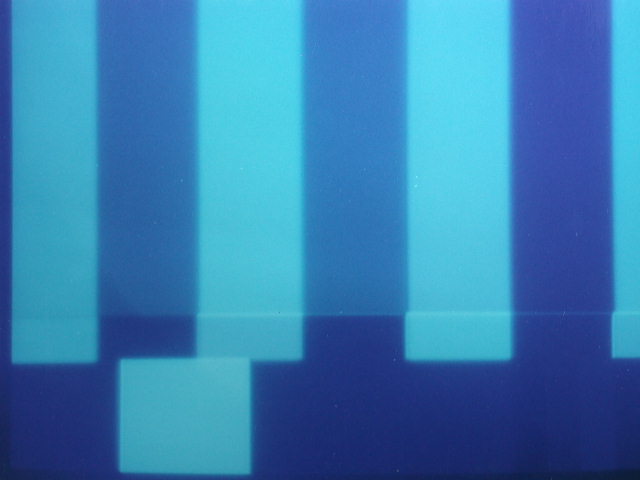
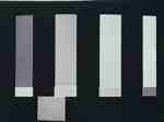
15 - 23 part 2 |
|
Activating the BLUE GUN switch tells
the monitor to display (sometimes in shades of blue, here in
black-and-white) only blue parts of the picture. The bars and
the corresponding boxes under them match in brightness (as if
the bars were longer) when the colors are correctly adjusted. |
|
|
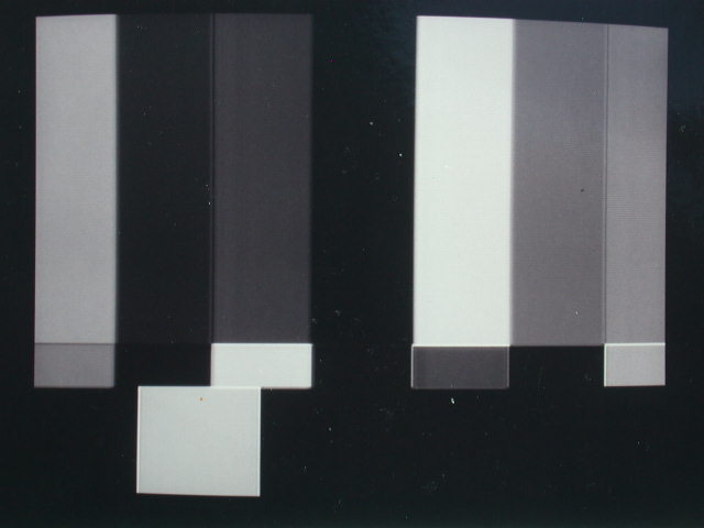
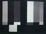
15 - 23 part 3 |
|
CHROMA or COLOR turned too high,
colors are too vivid. |
|
|
15 - 23 part 4 |
|
High CHROMA with BLUE GUN switched
on, causes the outer bars not to match the boxes under them.
Reduce CHROMA or COLOR until the bars match. Hint: If the last
bar is too light (compared to the box under it) reduce CHROMA. |
|
|
15 - 23 part 5 |
|
CHROMA low makes colors faded, pastel. |
|
|
15 - 23 part 6 |
|
Low CHROMA with BLUE GUN activated
causes outer bars not to match the boxes under them. Increase
CHROMA or COLOR until the bars match. Hint: If the last bar is
too dark (compared to the box under it) increase CHROMA. |
|
|
15 - 23 part 7 |
|
PHASE or HUE is misadjusted. Colors
aren't exactly right, although you might not notice unless you
had a good sense of color. A monitor with misadjusted HUE will
make faces look noticeably awful. |
|
|
15 - 23 part 8 |
|
Misadjusted PHASE or HUE with BLUE
GUN activated. The bars should alternate light-dark-light-dark,
but don't. Also, the bars fail to match the boxes under them. |
|
|
15 - 23 part 9 |
|
Slightly misadjusted PHASE or HUE
with BLUE GUN activated. Again the bars fail to alternate light-dark-light-dark,
but the effect is more subtle. The non-matching boxes below the
bars make the misadjustment easier to notice. |
|
|
15 - 24 part 1 |
Viewing COLOR BARS through a blue
lens |
Properly adjusted COLOR BARS on
a color monitor, as seen through the blue lens of a Monitor Analyzer.
The bars are evenly spaced and equal brightness. |
|
|
15 - 24 part 2 |
|
COLOR BARS on a misadjusted color
monitor as seen through a blue lens. |

|
|
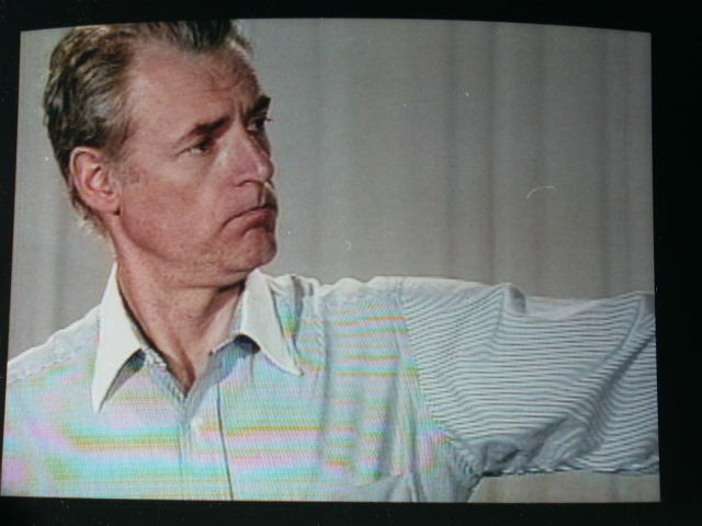
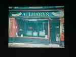
17 - 7 |
Striped shirt causes moire and color
flashing. |
Vertical stripes (chest) cause rainbows
while horizontal stripes (sleeve) shimmer into moving stripes
like a barber pole. |

|